Nike
Case Study: Air Force One
I was involved with many varied campaigns for Nike over a two year period.
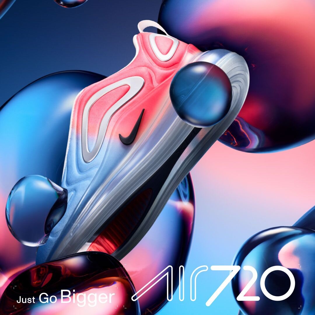
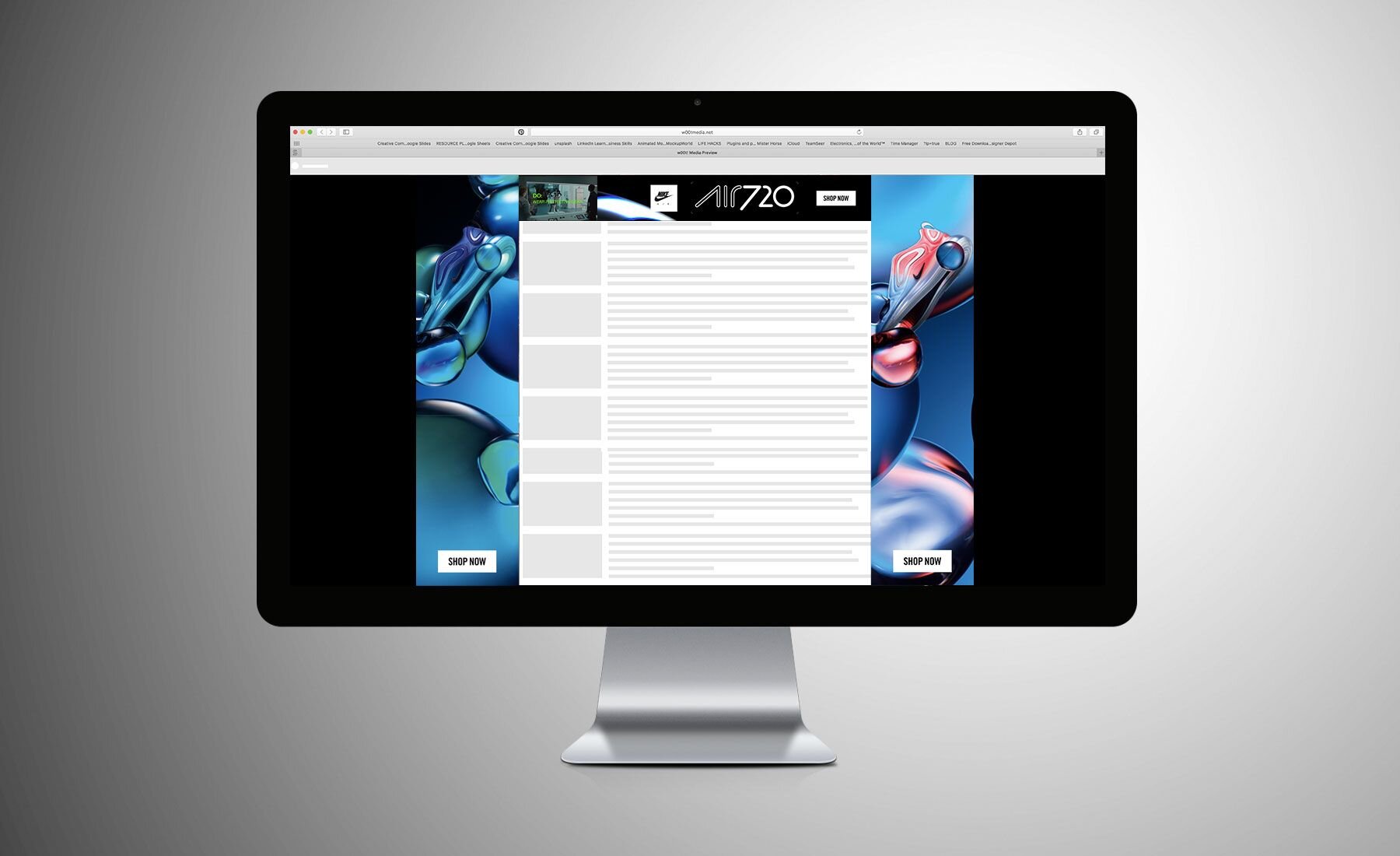
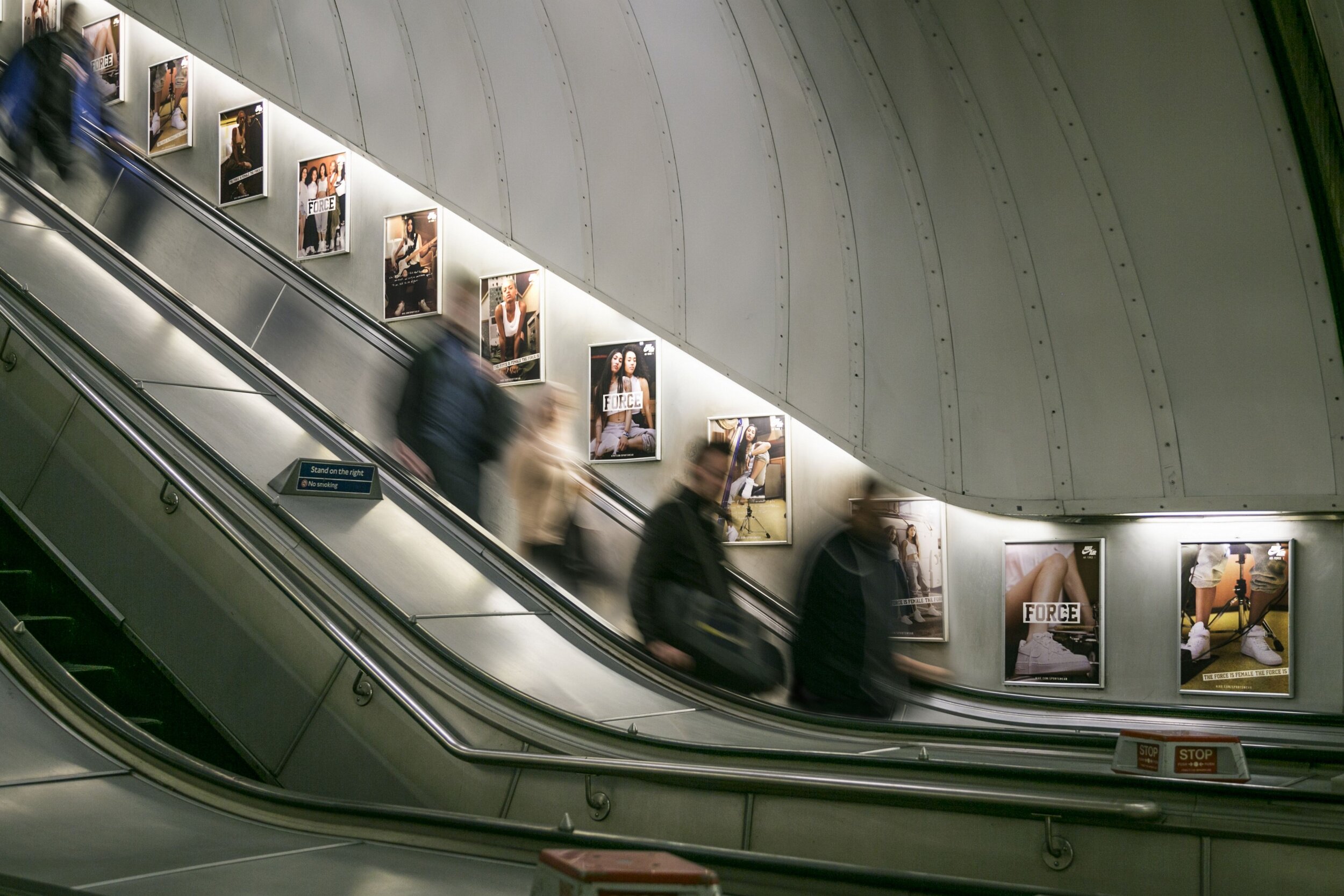
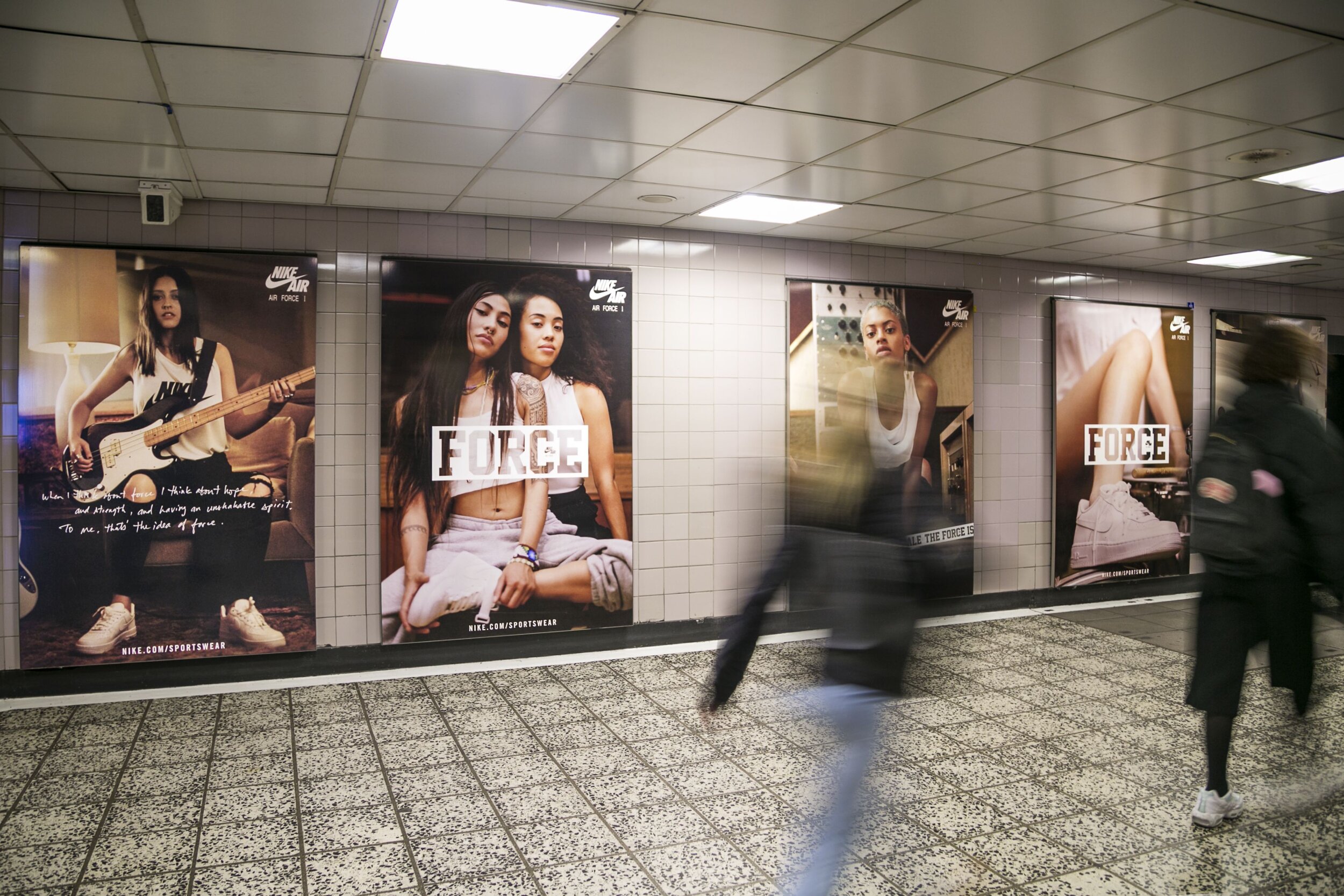
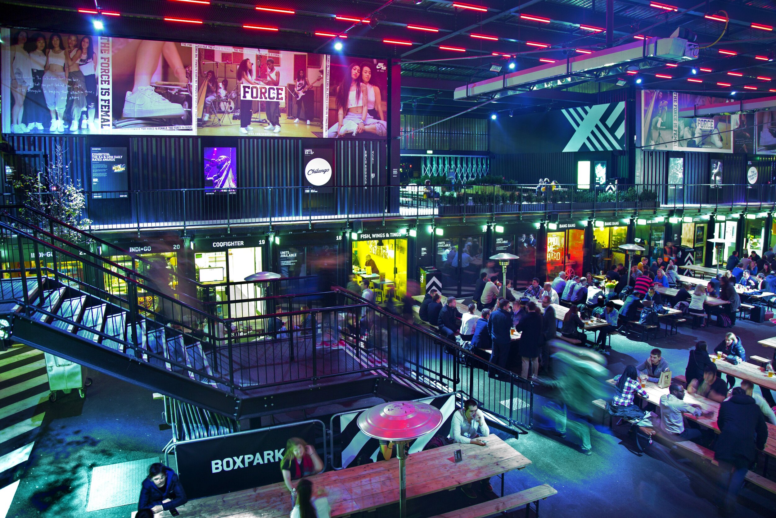
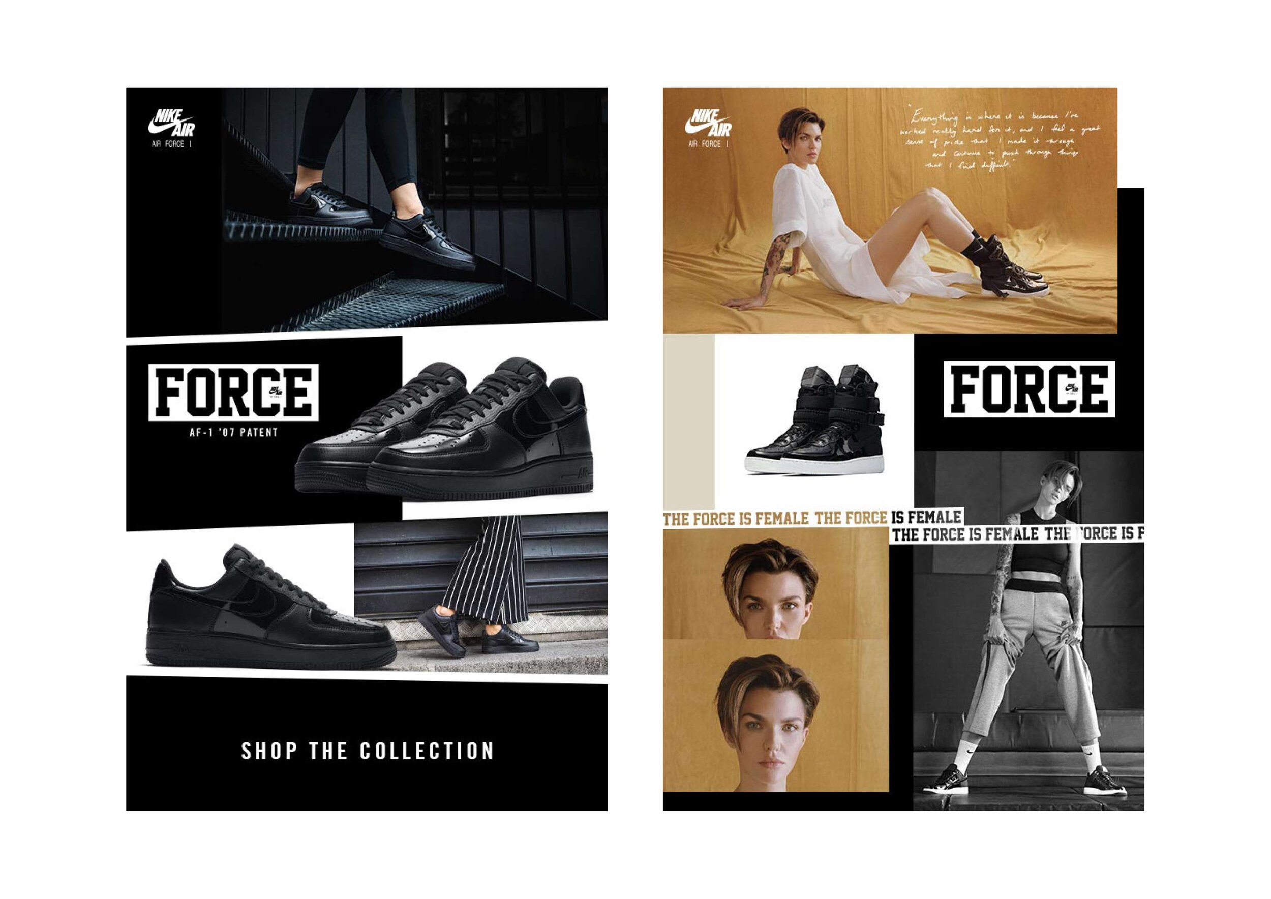
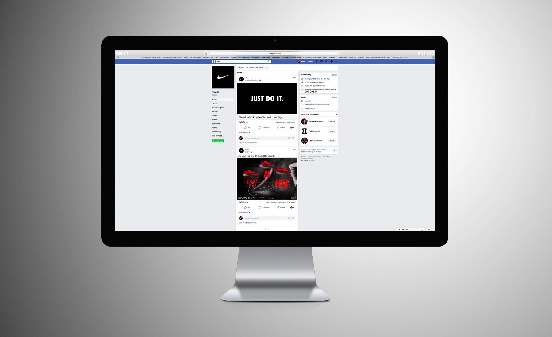
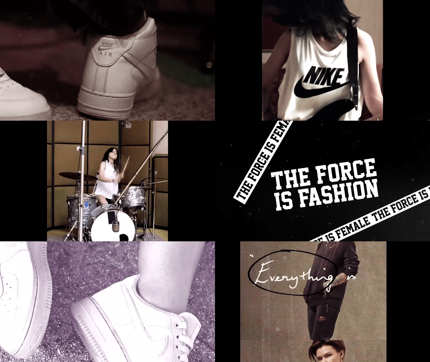
Air Force One Case Study: Using the brand’s campaign messaging and style guides I produced a series of print and digital advertisements for the launch of the new Air Force One range (and subsequent related launches) which integrated fashion, music and current affairs. Combining the Nike brand guidelines and the Air Force style guide I created a series of advertisements across different styles, dimensions and languages in collaboration with the Nike teams in London and Amsterdam. Nike provided the assets and it was then my job to create layouts and formats that worked in a bold and modern look for the brand. In some cases we needed to created a digital advertisement that could be replicated in different formats and languages therefore a comprehensive layout was produced to ensure this could be rolled out successfully across the campaign and it’s varied products.
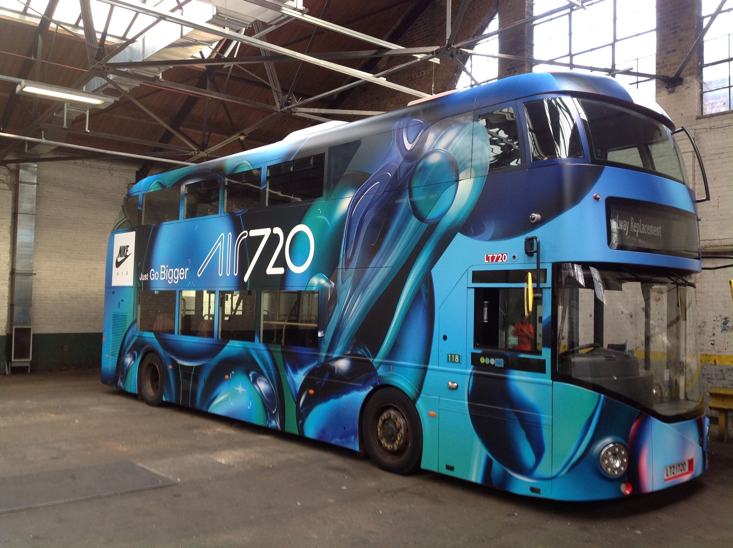
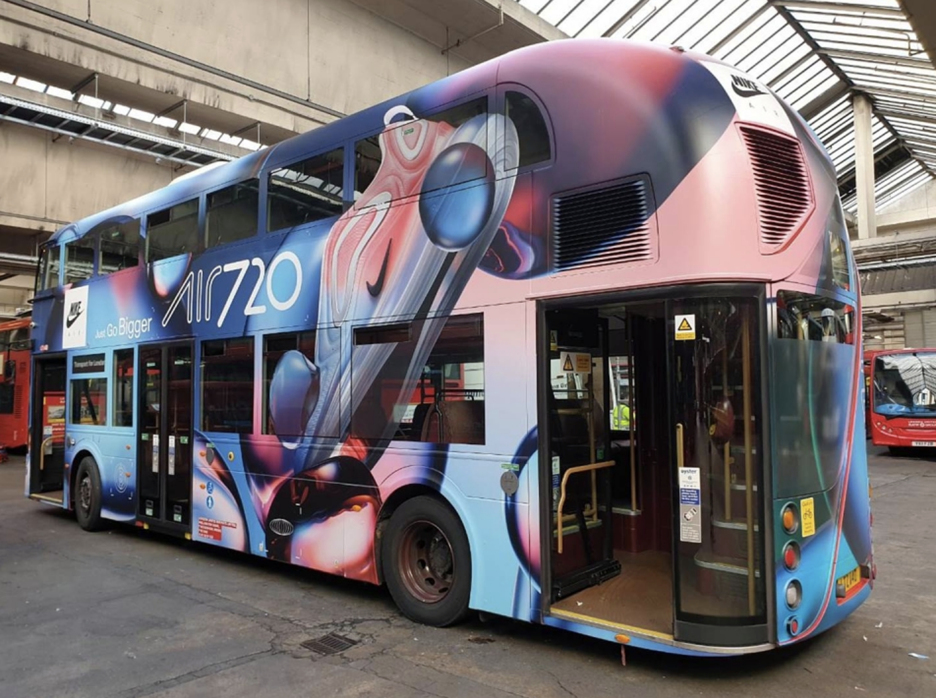
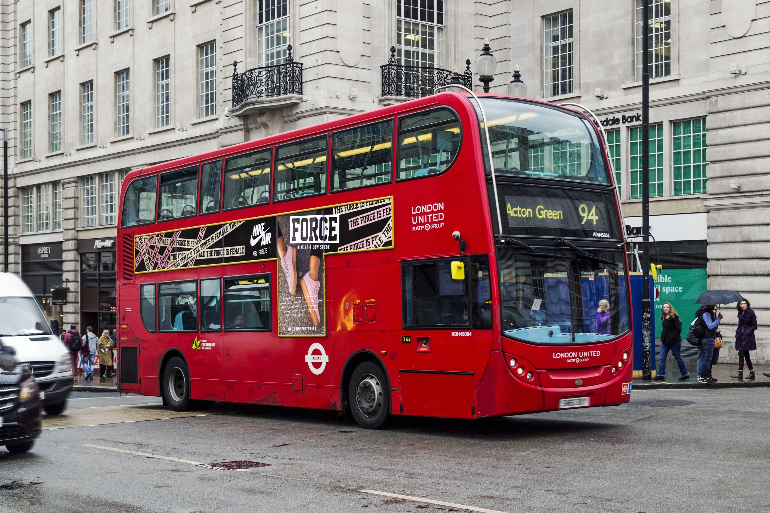
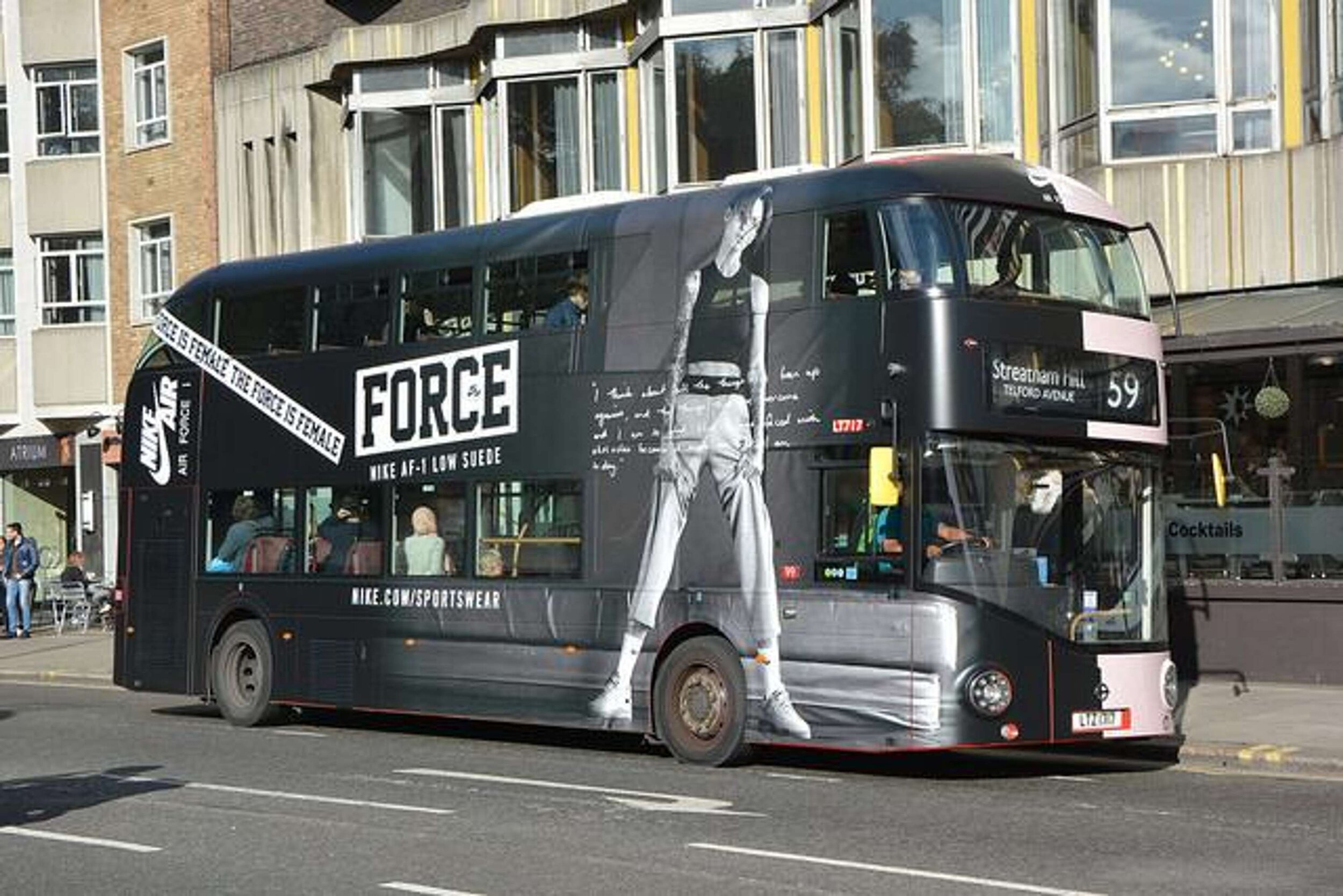
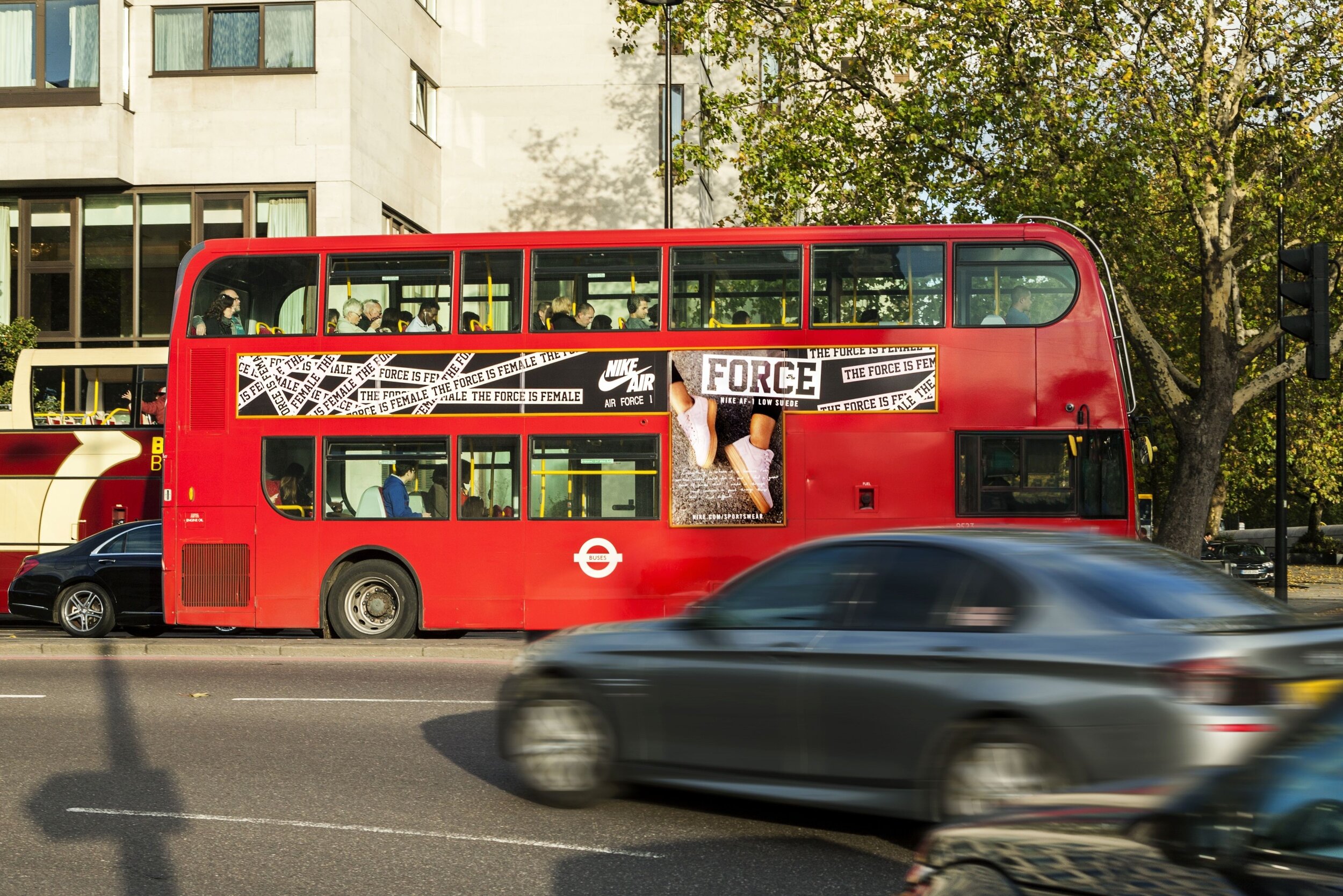
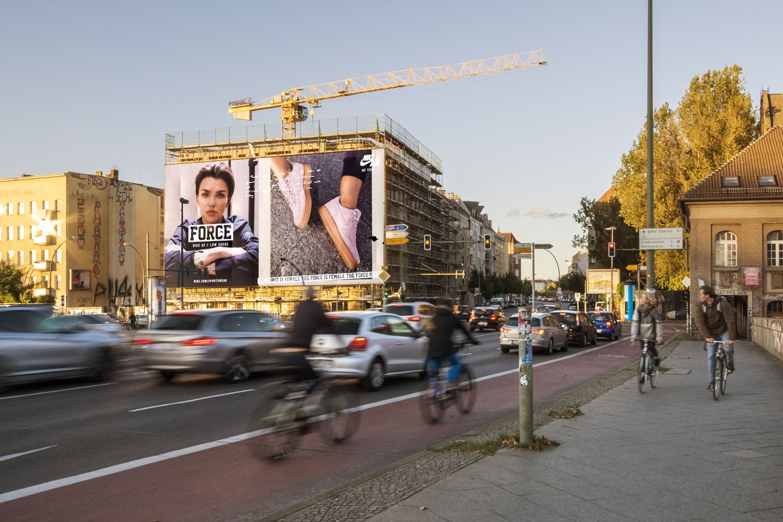
My work for Nike and this campaign also included designing large format London bus wraps and the artworking of a number of posters to be displayed across Berlin for the hero product launch in Europe, 2018






Dufry
Case Study: Rebrand and debut
Several successful design projects completed for Dufry. Two consecutive campaign concepts taken through from brief to execution in Airports globally.
My first concept after their big rebrand was the ‘Wildly Good Savings’ campaign, which was enormously successful.


First News
Designing a weekly issue, uploading to FTP server and corresponding with printers. Overseeing an Intern, managing design department needs in the absence as an acting Senior Designer and preparing all extra digital and interactive content (including keystage relevant documentation for use nationally in classrooms).
Hilton Hotels: Unlock Your Weekend
Case Study: Unlock Your Weekend Social Campaign
Objective: Drive fame for Hilton as a weekend, city break destination across UK, Germany, KSA and UAE with a hedonistic Millennial audience.
Insight: Travel guides give you the obvious sights to visit within city break destinations. These don’t reveal the beating heart of the city.
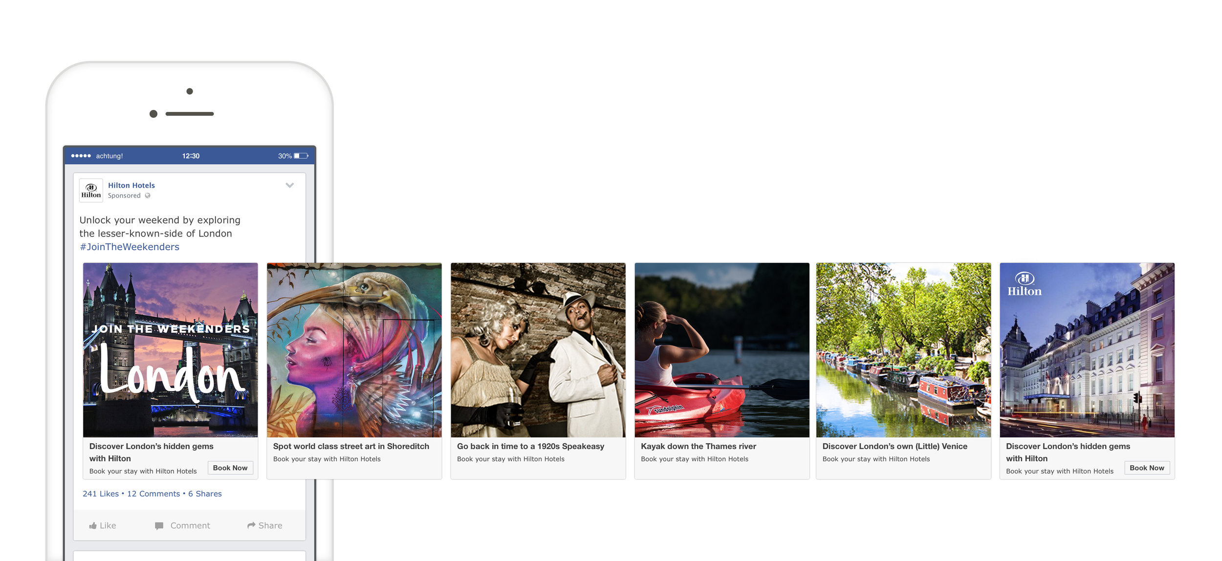
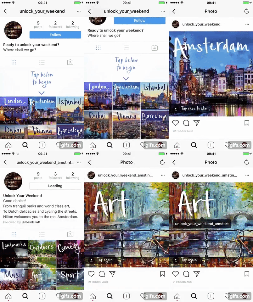
Idea: The Weekenders - an audience-led content series that unlocks the hidden and authentic, cultural gems within four key destinations - all enabled by Hilton Hotels.
The campaign was split into three distinct phases:
1. Impact - inspirational, spoken word film
2. Engage - travel guide canvas
3. Sustain - carousels, Stories and GIFs
Channels: Facebook and Instagram
Results
• Engagement rates 3x industry and platform benchmarks
• 7MN+ impressions
• 36% hero film completion rate
• 51% uplift in brand recall
I also created a brand first ‘tailor made experience’ generator via Instagram, and was in contact with a multitude of venues and individuals across the globe in order to dig out exciting places I could feature in my design.

British Retail Consortium
Case Study: 50 Year Rebrand Implementation
The British Retail Consortium has a distinguished history of championing retail in the UK and across the world. At a pivotal time for the industry, the brief was to create a new brand that would bring clarity of vision to their cause – uniting every group and individual that retail touches, from retailers and members to consumers and Government. Retail is dynamic, highly adaptive to customer demand and is undergoing transformational change.
For their first rebrand in 50 years, the trade agency had already contracted an external body for the new logo, but I was employed to single-handedly roll this out through all evergreen documents, new reports, digital magazines, posters, brochures, branding (on and offline, press and personal) and physically throughout the office. I was therefore required to seek out and engage with suppliers for portable pop-up stands, furniture, glass reception wraps and a plethora of other collateral. All this was completed within a short fixed term contract.


CIMA
Case Study:
Social rebranding
(Student engagement)
While working on the graphics and layout for the CIMA brochures, I was approached to assist in engaging the identified audiences with an emotive and provoking social content series that stopped people scrolling and motivated them to participate in the CIMA learning community.
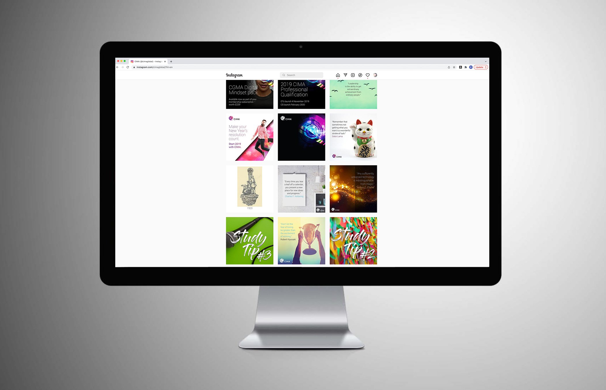
It was determined that we should take a multi-pronged approach using bold colour with approachable, snackable content pieces. I started by creating a filter frame that could be applied to photographs posted by CIMA participants to encourage engagement during exam season. These were then reposted with a credit to the author by CIMA, citing the participant’s level. The colour code would identify relevant content for each type of viewer.
Facebook long form study tips in a friendly and colourful style would be themed up to match the visuals. Key announcements for the courses were unified using brand colours and simple messaging, which helped to cut through other social activity and sat on all social channels.
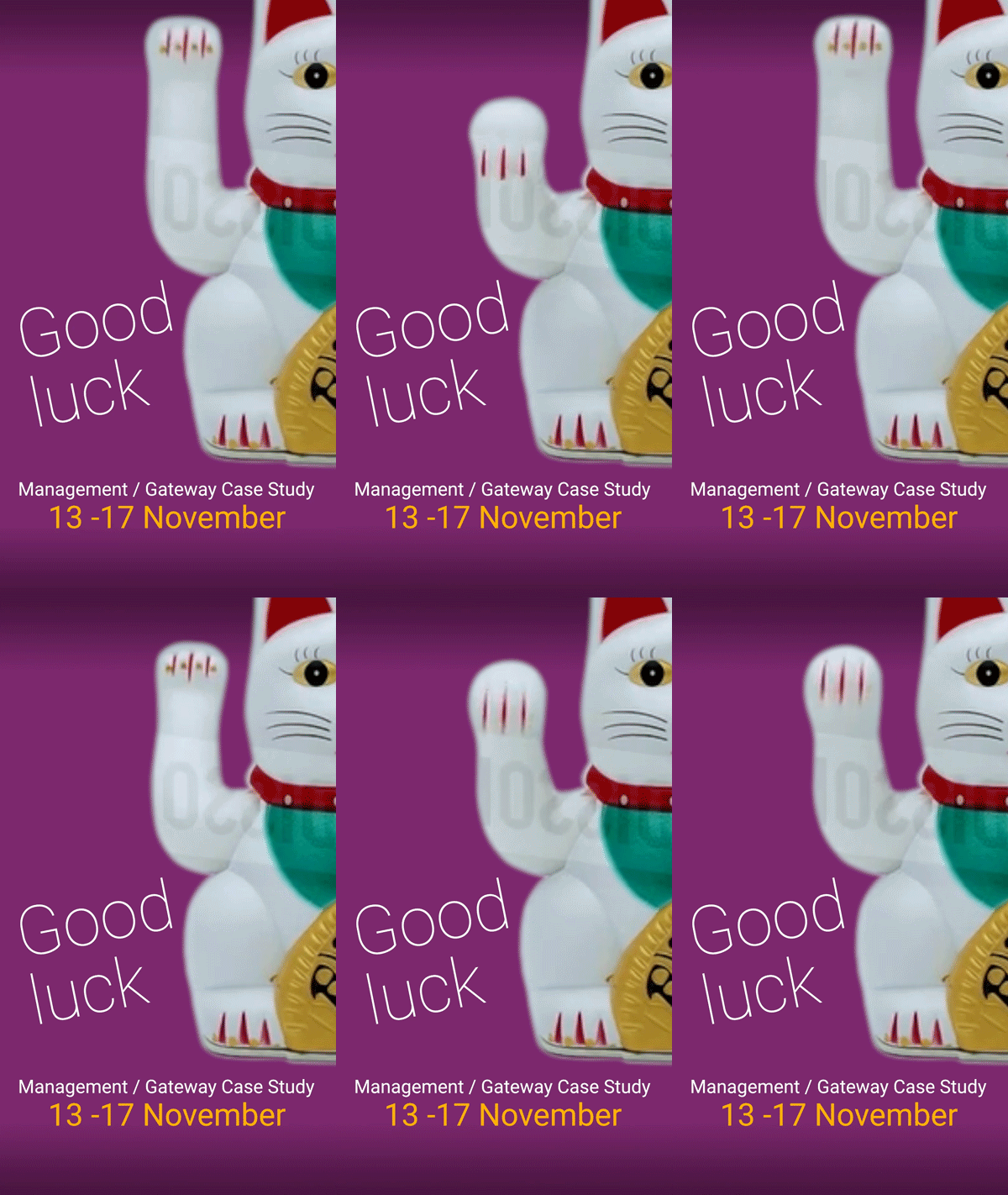
We proposed a brand first with regular short social videos targeted during important dates and exam reminders.





Google/Lowes
The Future Store Comic
(Lunch & Learn)
I was asked to conceptualise, illustrate and produce a short comic based on Google technology being used in future Lowes stores in the USA. For this project I produced a supporting animated short.


